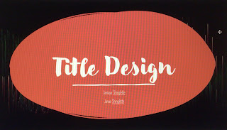
Planning Blog: Title Design
This PowerPoint document contains all the information about what the title should be in the movie's opening sequence. There is a name for each title and what to call it. It shows the fonts, colors and sizes to use. I also indicated the spacing between characters. The tentative titles of each title are also posted on Google Slides. We've already talked about how the title transitions into the movie and how long each one is on screen. is to I used the same size, color, and font for each title to make the titles look consistent. The same applies to fade-ins and fade-outs and the length of time each track is displayed on screen.
This is the link to the PowerPoint that I made for this blog:


Comments
Post a Comment